![dntly-icon-white.png]](https://support.donately.com/hs-fs/hubfs/dntly-icon-white.png?height=40&name=dntly-icon-white.png)
Donately's Form Builder has been updated since this article. To access newer Form Builder articles, click here.
When customizing your donation form, you have many choices on the form's style, including themes and custom elements.
We currently have 4 themes built-in to the builder. Click on the theme name in the list below to read a description.
Theme 1: Classic
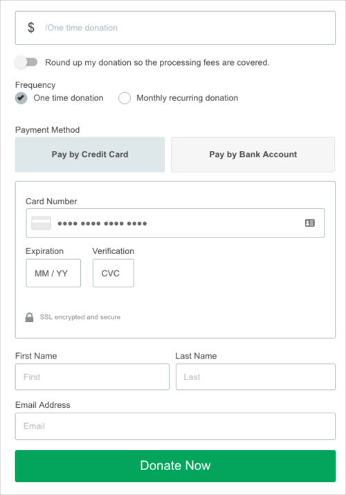
The Classic theme is our default theme. This theme has a clean yet minimal design that blends in well to all environments. For most websites, the Classic theme is designed to allow for seamless styles to match your brand.
If you'd like to change some of the elements of this theme, including button colors, fonts, or anything else, you can swap over the Custom theme, and easily edit those elements.
Additionally, you always have the option to custom-code CSS into the form, giving you total control over the design elements. See this guide for an overview of using our Custom CSS editor.
Theme 2: Modern
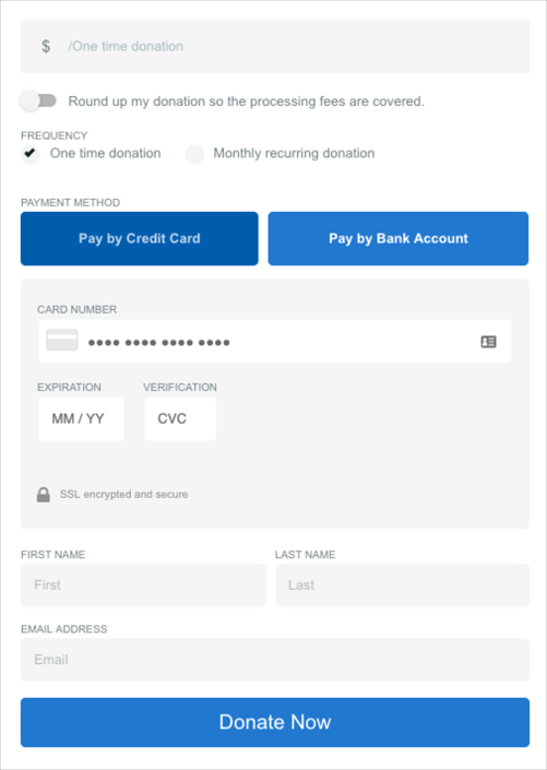
The Modern theme is a more stylistic update to our Classic theme. This theme includes more aggressive coloring and more modern design elements, such as heavily rounded corners, and darker field backgrounds. This is a great form for a more modern website, such as those that were custom coded or are more design-focused.
For the Modern Theme, you're able to customize:
Fieldset Options
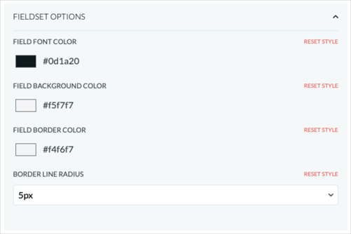
Field Font Color
This is the color of the text when entered by a user. By default, this is a dark color. We recommend matching this color to the field background color so that it is visible what the donor is entering into this field.
Additionally, we don't recommend making this color red, as that could lead donors to believe there are errors with their entry.
Field Background Color
This is the background of each field. You should be sure that the Field Font Color is still readable if changing the background of each field. That is - if your Field Font Color is a darker color, leaving the Field Background lighter works best, and vice versa.
Field Border Color
This is the border color of each field. This is one of our favorite ways to customize a donation form, as it adds a good amount of color in a very subtle way. This makes the form feel that much more custom and personal to your brand.
Border Line Radius
This refers to how round the corners of each field are. You have options from 0px (completely square) to 5px (rounded edges).
Label Options
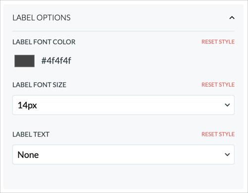
Label Font Color
This is the color of the label text above the field. This is another great, subtle way to add a unique style to your form and make it feel more custom. We would recommend weighing this color against the form background color. If the form background color is light, we recommend making the label field color light, and vice-versa.
Label Font Size
This is the size of the label text above each field. We don't recommend changing this unless necessary.
Label Text
This allows you to change the casing of the label text above each field. You can pick between Sentence Case (Capitalize), UPPERCASE, or lowercase.
Button Options
The button colors here refer to the preset suggestions, and the payment option buttons (Pay by Credit Card, Pay by Bank Account and/or Pay by PayPal). To change the Donate button styles instead, click here.
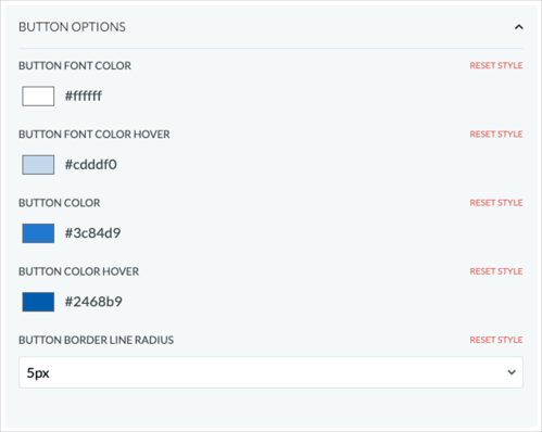
Button Font Color
This is the color of the text on the button. We recommend pairing this with the button background color. If the button color is dark, make the font color light, and vice versa.
Button Font Color Hover
This is the color of the text on the button when the button is hovered over by the donor's cursor. This provides a contrast to the static state of the button, giving the user an indication that this is their selection. We recommend pairing this with the button background hover color. If the button hover color is dark, make the font color light, and vice versa.
Button Color
This is the background color of the button when static, or not being hovered. This is one of the focal points of the style of the form, so you want to be sure that this matches your brand. It provides a really custom feel to the form. We recommend pairing this with the button background color. If the button text color is dark, make the font color light, and vice versa.
Button Color Hover
This is the background color of the button when hovered over, or not being hovered. This provides a contrast to the static state of the button, giving the user an indication that this is their selection. It provides a really custom feel to the form. We recommend pairing this with the button background hover text color. If the background hover color is dark, make the font color light, and vice versa.
Button Border Line Radius
This refers to how round the corners of the buttons are. You have options from 0px (completely square) to 5px (rounded edges).
Submit Button Options
The submit button colors here refer to the bottom submit/donate button only. To change the other buttons on the form, including the preset suggestions and payment option button styles instead, click here.
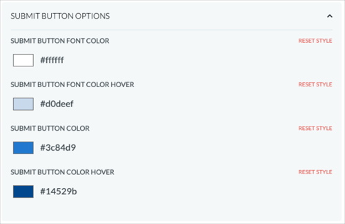
Submit Button Font Color
This is the color of the text on the submit button. We recommend pairing this with the submit button background color. If the submit button color is dark, make the font color light, and vice versa.
Submit Button Font Color Hover
This is the color of the text on the submit button when the submit button is hovered over by the donor's cursor. This provides a contrast to the static state of the submit button, giving the user an indication that this is their selection. We recommend pairing this with the submit button background hover color. If the submit button hover color is dark, make the font color light, and vice versa.
Submit Button Color
This is the background color of the submit button when static, or not being hovered. This is one of the focal points of the style of the form, so you want to be sure that this matches your brand. It provides a really custom feel to the form. We recommend pairing this with the submit button background color. If the submit button text color is dark, make the font color light, and vice versa.
Submit Button Color Hover
This is the background color of the submit button when hovered over, or not being hovered. This provides a contrast to the static state of the submit button, giving the user an indication that this is their selection. It provides a really custom feel to the form. We recommend pairing this with the submit button background hover text color. If the background hover color is dark, make the font color light, and vice versa.
Theme 3: Monochromatic
The Monochromatic theme is based on the Classic theme, but with a single color-scheme that works together.
Here, you can set a primary color that the main elements will automatically be based on. This includes the donation suggestions, the payment methods buttons, the submit button, field outlines, radio button selects, and more.
To change other style elements of this form, such as the background color or font, you will need to custom-code CSS into the form. See this guide for an overview of using our Custom CSS editor.
Theme 4: Custom
The Custom theme is perfect if you want to add your own personal style to the Classic theme. Choosing this brings up a litany of options to easily customize. Below, you'll see all the options available:
With some options, such as Font Family and Sizing attributes, we offer a limited number of built-in suggestions. If you would like to customize beyond what we offer, you will need to hard-code CSS into the editor. See this guide for an overview of using our Custom CSS editor.
General Options (Custom &
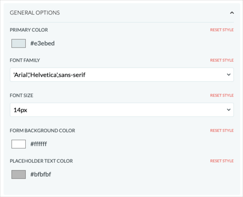
Primary Color
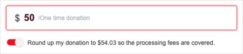
Adjusting this color changes some of the noticeable parts of this form, including the field shadow color and the donor pays fees toggle.
Font Family
This is the font of your donation form. We have built-in a handful of web-safe fonts. If you have a custom web font, you can always hard code that into the CSS Editor.
Font Size
You can select the size of the text in the form, ranging from 14px to 20px.
Form Background Color
This is the background color of the form itself. By default, the background color is transparent. Unless embedding over an image, we don't recommend adding a background color.
Placeholder Text Color
This is the color of the text that shows in the field before entering any text (placeholder text). This is a great way to add a subtle bit of color to your form. When you pick a color, we will automatically add a level of transparency that makes it clear to the user that this is placeholder text.
Fieldset Options
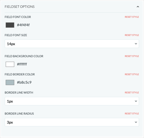
Field Font Color
This is the color of the text when entered by a user. By default, this is a dark color. We recommend matching this color to the field background color so that it is visible what the donor is entering into this field.
Additionally, we don't recommend making this color red, as that could lead donors to believe there are errors with their entry.
Field Font Size
This is the size of the text entered into each field. While the default is 14px, we do give you a choice up to 20px. We do not recommend making the text larger unless needed, as in some cases, that could conflict with the mobile version of the form.
Field Background Color
This is the background of each field. You should be sure that the Field Font Color is still readable if changing the background of each field. That is - if your Field Font Color is a darker color, leaving the Field Background lighter works best, and vice versa.
Field Border Color
This is the border color of each field. This is one of our favorite ways to customize a donation form, as it adds a good amount of color in a very subtle way. This makes the form feel that much more custom and personal to your brand.
Border Line Width
This is simply how wide the border is around each field. We recommend leaving this at 1px, but you can make it up to 5px wide if you'd like.
Border Line Radius
This refers to how round the corners of each field are. You have options from 0px (completely square) to 5px (rounded edges).
Label Options

Label Font Color
This is the color of the label text above the field. This is another great, subtle way to add a unique style to your form and make it feel more custom. We would recommend weighing this color against the form background color. If the form background color is light, we recommend making the label field color light, and vice-versa.
Label Font Size
This is the size of the label text above each field. We don't recommend changing this unless necessary.
Label Text
This allows you to change the casing of the label text above each field. You can pick between Sentence Case (Capitalize), UPPERCASE, or lowercase.
Button Options
The button colors here refer to the preset suggestions, and the payment option buttons (Pay by Credit Card, Pay by Bank Account and/or Pay by PayPal). To change the Donate button styles instead, click here.
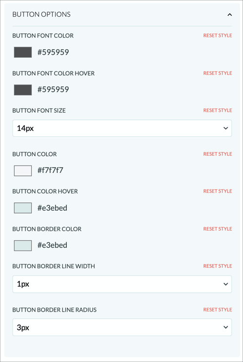
Button Font Color
This is the color of the text on the button. We recommend pairing this with the button background color. If the button color is dark, make the font color light, and vice versa.
Button Font Color Hover
This is the color of the text on the button when the button is hovered over by the donor's cursor. This provides a contrast to the static state of the button, giving the user an indication that this is their selection. We recommend pairing this with the button background hover color. If the button hover color is dark, make the font color light, and vice versa.
Button Font Size
This is the size of the font of the text inside each button. We don't recommend changing this unless necessary.
Button Color
This is the background color of the button when static, or not being hovered. This is one of the focal points of the style of the form, so you want to be sure that this matches your brand. It provides a really custom feel to the form. We recommend pairing this with the button background color. If the button text color is dark, make the font color light, and vice versa.
Button Color Hover
This is the background color of the button when hovered over, or not being hovered. This provides a contrast to the static state of the button, giving the user an indication that this is their selection. It provides a really custom feel to the form. We recommend pairing this with the button background hover text color. If the background hover color is dark, make the font color light, and vice versa.
Button Border Color
This is the border color of each button, in both static and hover state. We recommend having this add a little contrast to the colors, just to separate it from the rest of the form.
Button Border Width
This is simply how wide the border is around the buttons. This is a good way to make the border color pop against the button color.
Button Border Line Radius
This refers to how round the corners of the buttons are. You have options from 0px (completely square) to 5px (rounded edges).
Submit Button Options
The submit button colors here refer to the bottom submit/donate button only. To change the other buttons on the form, including the preset suggestions and payment option button styles instead, click here.
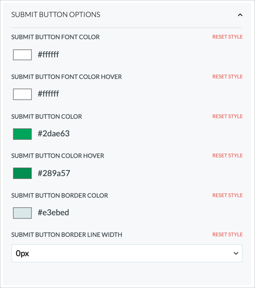
Submit Button Font Color
This is the color of the text on the submit button. We recommend pairing this with the submit button background color. If the submit button color is dark, make the font color light, and vice versa.
Submit Button Font Color Hover
This is the color of the text on the submit button when the submit button is hovered over by the donor's cursor. This provides a contrast to the static state of the submit button, giving the user an indication that this is their selection. We recommend pairing this with the submit button background hover color. If the submit button hover color is dark, make the font color light, and vice versa.
Submit Button Color
This is the background color of the submit button when static, or not being hovered. This is one of the focal points of the style of the form, so you want to be sure that this matches your brand. It provides a really custom feel to the form. We recommend pairing this with the submit button background color. If the submit button text color is dark, make the font color light, and vice versa.
Submit Button Color Hover
This is the background color of the submit button when hovered over, or not being hovered. This provides a contrast to the static state of the submit button, giving the user an indication that this is their selection. It provides a really custom feel to the form. We recommend pairing this with the submit button background hover text color. If the background hover color is dark, make the font color light, and vice versa.
Submit Button Border Color
This is the border color of the submit button, in both static and hover state. We recommend having this add a little contrast to the colors, just to separate it from the rest of the form.
Submit Button Border Width
This is simply how wide the border is around the submit button. This is a good way to make the border color pop against the button color.