![dntly-icon-white.png]](https://support.donately.com/hs-fs/hubfs/dntly-icon-white.png?height=40&name=dntly-icon-white.png)
Follow the following instructions to add custom CSS to your form.
Please note a few things:
1. If you are embedding your donation form on a secure (https) external website, the form will inherit many of your styles that are already present. This includes styles such as the font and some spacing options. You may want to try embedding to see which styles are inherited before making CSS changes directly to the form.
2. If you are using the Donately pages, you are able to change almost every style, however, some may be locked. If you experience issues, let us know and we may be able to find a workaround!
3. You'll need to find the Hex Code for any color you'd like to change. Click here to use one of our favorite tools to find a hex color.
In Step 3 below, you'll find a list of basic style customizations.
Step 1. Navigate to the Forms page
From any page, click on "Forms" from the left-side menu.
You can add custom CSS to an existing form, or add it to a new form. Once you get through your edits, you'll be changing the styles on the Design tab.
Just note, if you are editing an already embedded form on an external site, you may need to replace the entire script tag of the form with the new one you are going to create. For more information on that, see our article on Embed Options.
Note: If you embedded your form before June 2020, you will need to re-embed after any change. Once you embed using our new codes, all updates will automatically show on your site.
Depending on which theme you chose, you may need to get into some custom CSS to change the styles. We've compiled a handful of examples in this article that you can use to customize basic elements of the form, such as the button colors or field outlines. You can work off the templates we give below here, or if you're experienced with CSS, you can customize your own styles and paste those into the builder.
Clicking on your desired customization below will take you directly to our examples. Note with any style, we recommend adding an "!important" tag before the closing ";". Those are included in all of our examples below, but keep that in mind for any free-hand CSS customization.
The list below is in order of how they would appear on most forms:
Preset Button CustomizationsPayment Section Customizations
Field/Input Customizations
Donate Button Customizations
General Donation Form Customizations
Preset Button Customizations
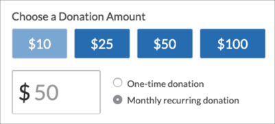
Preset buttons color
To really match the form to your style, you can also customize the color of the preset buttons at the top of the form. Just like the donation button, you can also set a different color when the form loads and when hovered over.
Note, we recommend adding the "!important" flag behind the colors to ensure they display.
.donately-preset-fields .donately-preset-amounts label {
background-color:#3c78bd !important;
}
.donately-preset-fields .donately-preset-amounts label:hover {
background-color:#8bb0da !important;
}
Static
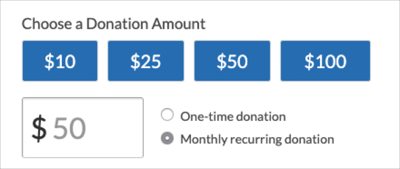
On Hover
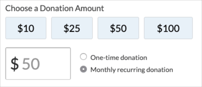
Preset button text color
Just like with the donation button, you can also change the text color if you'd like a light color on your presets.
.donately-preset-fields .donately-preset-amounts label {
background-color:#3c78bd !important;
color:#000000 !important;
}
.donately-preset-fields .donately-preset-amounts label:hover {
background-color:#8bb0da !important;
color:#000000 !important;
}
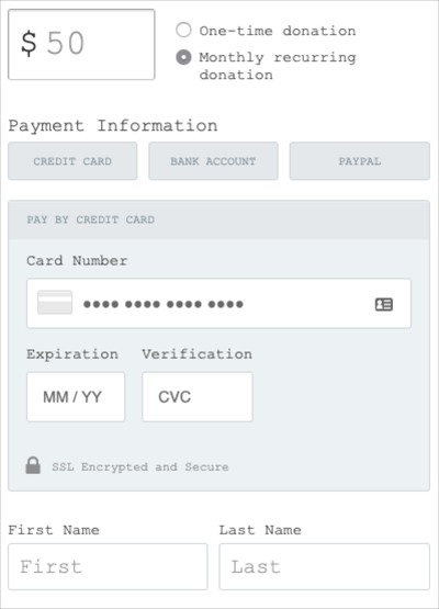
Payment Section Customizations
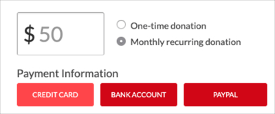
Payment Buttons
Similar to the preset buttons, you can also customize the button colors of the payment options:
.donately-payment-fields .donately-payment-options label {
 background-color: #cc0000 !important;
 border-color: #cc0000 !important;
 color: #ffffff !important;
}
.donately-payment-fields .donately-payment-options label:hover {
 background-color: #ff4d4d !important;
 border-color: #ff4d4d !important;
 color: #ffffff !important;
}
Static
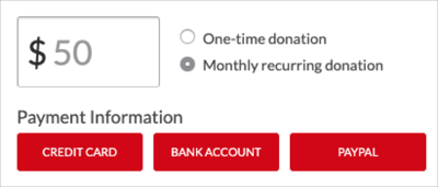
On Hover
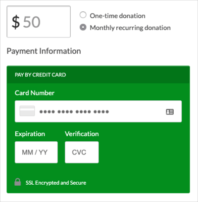
Payment Fields color
Follow this template to customize the background color and font colors of the payment capture fields.
Note, the background of the payment fields are not able to be adjusted for our Campaign and Fundraising pages.
.donately-secure-fields {
 background-color: #009900 !important;
 border-color: #009900 !important;
}
.donately-secure-header {
 background-color: #008000 !important;
 border-color: #008000 !important;
 color: #ffffff !important;
}
.donately-secure-footer span {
 color: #ffffff !important;
}
.donately-label.donately-card-number-label {
 color: #ffffff !important;
}
.donately-label[for=donately-card-exp-month] {
 color: #ffffff !important;
}
.donately-label[for=donately-card-cvc] {
 color: #ffffff !important;
}
Field/Input Customizations
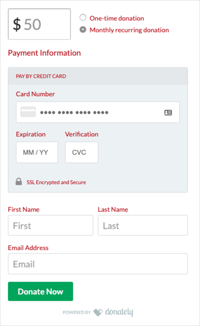
Field Label Text color
If you'd like to change all elements of text on the form, use the following template:
label.donately-label {
 color: #b30000 !important;
}
.donately-secure-header {
 color: #b30000 !important;
}
.donately-secure-footer span {
 color: #b30000 !important;
}
.donately-label.donately-card-number-label {
 color: #b30000 !important;
}
.donately-label[for=donately-card-exp-month] {
 color: #b30000 !important;
}
.donately-label[for=donately-card-cvc] {
 color: #b30000 !important;
}
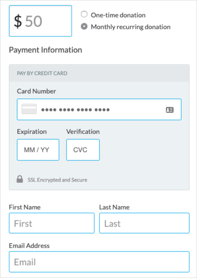
Field outline color
Another element that provides a great touch to match your brand is the outline of either field:
#donately-amount {
 border: 1px solid #00B0EC !important;
}
#donately-first-name {
 border: 1px solid #00B0EC !important;
}
#donately-last-name {
 border: 1px solid #00B0EC !important;
}
#donately-email {
 border: 1px solid #00B0EC !important;
}
#donately-phone-number {
 border: 1px solid #00B0EC !important;
}
#donately-street-address {
 border: 1px solid #00B0EC !important;
}
#donately-street-address-2 {
 border: 1px solid #00B0EC !important;
}
#donately-city {
 border: 1px solid #00B0EC !important;
}
#donately-state {
 border: 1px solid #00B0EC !important;
}
#donately-zip-code {
 border: 1px solid #00B0EC !important;
}
#donately-country {
 border: 1px solid #00B0EC !important;
}
#donately-comment {
 border: 1px solid #00B0EC !important;
}
#donately-onbehalf {
 border: 1px solid #00B0EC !important;
}
.donately-stripe-card-element {
 border: 1px solid #00B0EC !important;
}
Donate Button Customizations
Donate Button color
Changing the button color on the donation form is one of the simplest, yet most impactful customizations you can make! Matching that color to your brand enforces authenticity and trust.
To change the button color when static and on hover, we'll start with this base:
.donately-donation-form .donately-btn {
 background-color: #3333cc !important;
}
.donately-donation-form .donately-btn:hover {
 background-color: #050514 !important;
}
With this code, the button will change when the form loads, then again when someone hovers over it. This creates a really cohesive experience that gives the donor confidence that they are about to donate.
Static
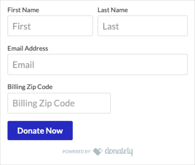
On Hover
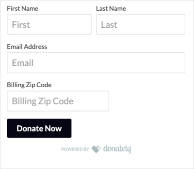
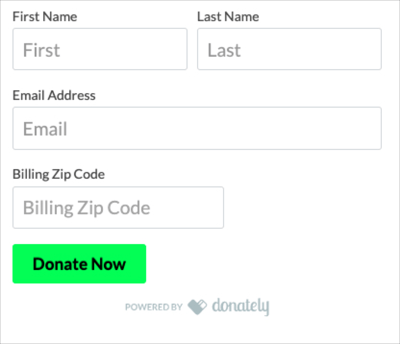
Donate Button Text Color
If you are using a lighter color that makes it hard to see the default-white text color, you can also target the text color specifically:
.donately-donation-form .donately-btn {
 background-color: #ccffcc !important;
 color: #000000 !important;
}
.donately-donation-form .donately-btn:hover {
 background-color: #4dff4d !important;
 color:#000000 !important;
}
Static
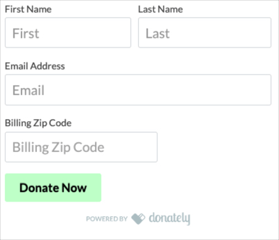
On Hover
General Donation Form Customizations
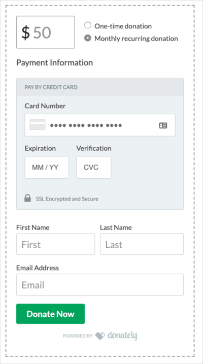
Border around form
In cases where you'd like an outline around the outside of the form, you can add a border that runs the perimeter of the form:
.donately-donation-form {
 border: 2px solid #b3b3b3 !important;
 padding: 20px !important;
}
With this technique, we recommend adding some padding, as you'll see on the second line. This will make the outline a little further out from the form as opposed to very tight against the edges.

Additionally, while this example is a solid outline, you could also do a dashed or dotted outline if you wish to do so.
.donately-donation-form {
 border: 2px dashed #b3b3b3 !important;
 padding: 20px !important;
}
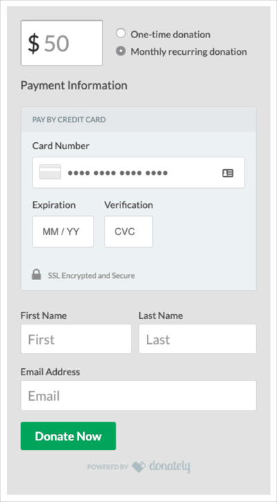
Full form background-color
If you'd like to change the background color of the donation form to better match against your site, you can do some in a similar way as a border:
.donately-donation-form {
 background-color: #e6e6e6 !important;
 padding: 20px !important;
}
Similarly to a border, we recommend adding some padding to the style so the background doesn't hug tight to the outline of the form.
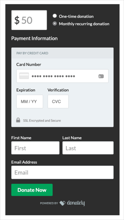
If you prefer a darker background color that conflicts with the default dark text color, you can target that specifically as well. Notice, if you pick a light color for the text, you'll need to add special instructions for the payment information headers so that they stand out against a light background.
.donately-donation-form {
 background-color: #333333 !important;
 padding: 20px !important;
}
label.donately-label {
 color: #ffffff !important;
}
.donately-label.donately-card-number-label {
 color: #000000 !important;
}
.donately-label[for=donately-card-exp-month] {
 color: #000000 !important;
}
.donately-label[for=donately-card-cvc] {
 color: #000000 !important;
}
Font Style
If you'd like to change the font of the donation form, follow the template below. Note, because the spacing is designed for sans-style fonts, there are some fonts that could throw off the spacing slightly. You can see in the example below that Courier New makes the "Recurring donation" label wrap.
.donately-donation-form * {
 font-family: Courier New !important;
}
Custom Font
If you have a custom font that you want to use, you'll need to embed that font using the 'font-face' CSS property.
The font needs to be hosted somewhere public on the Internet, like at the free Google Fonts Library. Another alternative, is if you are using a website builder like Wix - is to look at the source code on one of your pages and find out where Wix is hosting the font, like in the example below.
@font-face {
  font-family: 'Omnes';
  src: url('https://static.wixstatic.com/ufonts/e6dc4a_d96d8cca25b0457d977c8db1245ea93f/woff2/file.woff2') format('woff2'),
  url('https://static.wixstatic.com/ufonts/e6dc4a_d96d8cca25b0457d977c8db1245ea93f/woff/file.woff') format('woff'),
  url('https://static.wixstatic.com/ufonts/e6dc4a_d96d8cca25b0457d977c8db1245ea93f/ttf/file.ttf') format('ttf');
}
.donately-donation-form * {
    font-family: Omnes !important;
}
You'll want to include the 'woff2', 'woff', and 'ttf' versions to cover 99.9% of browsers
Let us know if you have any questions!