![dntly-icon-white.png]](https://support.donately.com/hs-fs/hubfs/dntly-icon-white.png?height=40&name=dntly-icon-white.png)
The "Image Position" selector is a valuable tool to be sure that your cover photo looks great on all devices.
On larger screens, such as desktops, laptops, and most tablets, most of the cover image will always show. However, when the screen size scales down, we have to do some magic in order to continue to display the image at it's best resolution. This prevents pixelated images or images that are too zoomed in or out.
Specifically, on mobile devices, this means shifting the image to fit a much narrower screen. Accordingly, since the full-size image is a wide-ratio, our pages cut off the sides of the image on mobile devices to display properly.
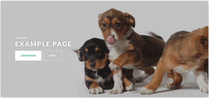
Take, for example, this image:

On full-size monitors & most tablets, we're able to display most of that whole image, which gives the viewer good context as to what the image is showing:
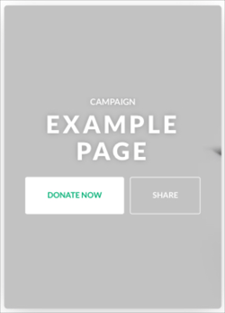
However, by default, in order to make that image scale down for a mobile screen, we zoom in to a specific part of the image, which may not be what you'd like. For the above example, here is what you would see on a phone:
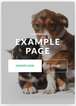
The fix for this is to use the image position selector to hone in on a specific part of the image to be the focus point. Using the above example, selecting the bottom-center position will make the mobile page display like this:
It may take some quick trial-and-error to find the best image position, but the payoff is a beautiful Campaign page that displays a great image on all devices!